Oct 11 2012
The Scale of the Universe
I came across this brilliant interactive demo that puts the size of everything into perspective – The Scale of the Universe!
Enjoy feeling big (and small) :D
Comments Off on The Scale of the Universe
Oct 11 2012
I came across this brilliant interactive demo that puts the size of everything into perspective – The Scale of the Universe!
Enjoy feeling big (and small) :D
Comments Off on The Scale of the Universe
Sep 29 2012
Morning! Another nice inforgraphic that I saw recently (click image to see larger version):
This one was published by Visage Mobile.
Comments Off on The Staggeringly Huge Future of Mobility
Sep 19 2012
A nice infographic on Internet usage by Visual.ly (click image to see larger version):
(There are many other very interesting infographics on that website also!)
Comments Off on Internet Usage Worldwide
Jul 21 2012
A nice inforgraphic on mobile phone usage by Inneractive (click image to see larger version):
The infographic states that battery consumption is correlated with transmission levels. I can believe that. However, I would have thought that the data requirements of running apps would have a greater influence on transmission levels than geographical network conditions :o
Comments Off on Mobile Phone Usage
Jul 15 2012
The BBC asks if the US one cent coin should be abandoned in The US penny: Should it be scrapped?.
It also provides the following nice infographic:
It is an interesting question, and I do not have a strong opinion on it either way.
However, I would not like the Euro cent to be discontinued!
Comments Off on The End of the US Cent Coin?
Jun 17 2012
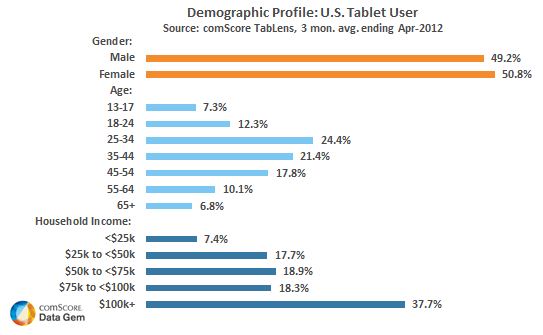
I came across an interesting tablet user demographic during the week in Tablet users are older, richer and more likely to watch video – study. The article title contains all the key points, but I will include the figure here regardless.

Tablet User Demographic (Copyright ComScore)
Have a good weekend!
Comments Off on Tablet User Demographic
Apr 14 2012
I spent my afternoon setting-up a new laptop. I usually choose my passwords securely, but it reminded me of this infographic that I saw a while ago (click image to see larger version):
The original article where I saw this inforgraphic is Use This Infographic to Pick a Good, Strong Password.
Apr 08 2012
It seems impossible to spend any time online these days without hearing about Pinterest. It certainly seems to be going from strength to strength, and it is now the third most popular social networking site according to Pinterest is third most popular social site after Facebook and Twitter.
I admit that I have not used it yet. I intend to try it, but at the moment I do not really see what the attraction is! Pinterest’s first investor explains this attraction in Pinterest’s First Investor Explains the Secret to the Startup’s Success, but I still do not get it!
This week I came across this very nice infographic in Flowtown Infographic: Why Is Pinterest So Addictive? that explains Pinterest’s addictiveness (click image to see larger version):
(There are some other very nice infographics on that website also!)
I think that I should give Pinterest a try!
Mar 26 2012
I came across this interesting infographic in Job Wars: How Google Stacks Up Against Facebook over the weekend:
Enjoy!
Comments Off on Google Versus Facebook as Employers
Jan 28 2012
Another (after Tablets At Work) nice tablet infographic (click image to see larger version):
This one is taken from How we use our tablets (Infographic).
Comments Off on Tablet Use