Jul 24 2022

N26 Review

Category: Mobile Computing,Money,ReviewsTeknovis @ 08:54

Background

There is lots happening in the consumer banking space in Ireland at the moment. Two banks are leaving (KBC and Ulster Bank), and the others are vying for the business.

Thankfully these departures do not impact me because I use Bank of Ireland. However, I really dislike Bank of Ireland for the following reasons:

  • The mobile app experience is horrible. It uses really old technology. I think that it is simply a web browser wrapper for a mobile website.
  • The mobile application looks really dated. Perhaps it would have looked good 15 years ago.
  • The mobile application is extremely cumbersome to use.
  • The mobile application does not provide any notifications relating to money entering or leaving the account.
  • The desktop interface is equally horrible – especially on a widescreen display.
  • The ability to self-service is very poor.
  • There are no analytics.

Requirements

So I started looking around for a new bank. My initial intention is that the new bank account will complement (rather than replace) my existing bank account. This can obviously change if the new bank account works well.

I do not use a wide range of banking services. Instead there are a few services that need to use a lot. So my criteria are fairly simple:

  • Support for Google Pay/Google Wallet.
  • Full support for both mobile and desktop interfaces, because I use both my phone and my computer for banking.
  • Send and receive money within the Eurozone using IBANs (but not particularly urgently).
  • Free or low cost for basic services.
  • Primarily for use in the Eurozone (not only Ireland).

I am not interested in ATM withdrawals, savings schemes, foreign exchange, travel services, crypto currencies, and any general gimmicks.

Options

Irish Banks and Financial Institutions

I looked at the Irish banking options, but none particularly excited me. If I had to use an Irish option, then I think that the Credit Union option looked the most promising.

Revolut

Next on my list was Revolut. I know many people who happily use it, but my general impression is that it is aimed more at teenagers, and that it focuses more on gimmicks rather than core services.

Nonetheless I investigated Revolut, but ultimately there were two things about which I was unhappy:

  • Russia and the UK feature in its ownership and operations.
  • The desktop interface appears to only provide a subset of services.

N26

I had heard of N26 before, and it is generally mentioned in reviews of online banks, such as the following:

So I decided to proceed with N26 after reading as many reviews as I could online.

Fun fact: N26 got its name form the number of cubes in a Rubik’s Cube!

Opening the Account

The N26 website stated that I would be added to a waiting list before I tried to open my account, but there was no waiting when I opened my account. The process for opening the account was very straight-forward.

I initially opened a free “Standard” account. However, my intention was to then upgrade to a “Smart” account (more about this later). My reasons for updating were that I was interested in:

  • Spaces
  • Shared sub-accounts

You can see the differences between the various accounts in Find a plan for you.

Physical Card

You can order a physical card with the Standard account, but I have not dine this yet. I will probably get one as a backup, although I do not currently see any need for it.

One thing that I dislike about all of the cards is that they look so bland!
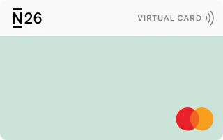
N26 Debit Card
N26 Debit Card

I would love (in other words, pay) to be able to upload my own image for printing on a physical card!

Experience to Date

I have been using the account for a few months now and so far I am loving it!

The mobile and desktop interfaces are lovely. I use the dark themes, and they look great! I love that retailers’ logos appear alongside their associated payments. It makes finding a particular payment very easy.

Electronic transfers, online payments, and contactless payments all work flawlessly, and I have had no problems so far. I love that I get notifications on my phone when money enters or leaves my account.

One thing that I am not very clear on is how contactless payments above 50€ work. I have had one purchase that was almost 100€. The merchant told me that it accepted contactless for this, so I used my phone. I was asked for a password, but it was not clear to me which password I should use. I tried one, it did not work, and then I paid using a different method because I did not want to lock my account.

Problem

I have only had one problem so far… My partner tried to open an N26 account at the same time as me, but this application was rejected with an unhelpful message:

We’ve reviewed the information you provided and we must inform you that according to our current verification procedures, we’re unable to offer you an N26 bank account at this time.

It is a useless message, because it does not explain what the problem is, or how it can be solved. This is where a bank with a physical presence would be better than an online bank.

I do not understand what went wrong, because my partner and I have almost identical backgrounds (from a financial perspective).

I pursued this with N26’s online support. The assistance was very understanding of my problem, and I was assured that this would be investigated.

As promised, we received a follow-up email a few days later However, it was also equally useless:

We couldn’t confirm your application to open a new account, since your user information could not be validated.

I have two theories about the cause of the problem:

  • My partner’s passport seemed to be more reflective than my passport, so maybe the details could not be extracted from it.
  • Perhaps some version of my partner’s address was not matching the current address that we provided.

Conclusions

N26 is great so far! However, unless my partner is able to open an account then I will definitely not upgrade to the Smart account, and it is quite likely that I will move to another bank.

The next step is to try opening an account for my partner by changing some of the details (such as using better lighting for the passport photos, using an alternative postal address).

I will follow-up with another blog post…

Tags: , , , , ,


Sep 29 2021

Laptop Travel Accessories

Category: Hardware,ReviewsTeknovis @ 22:09

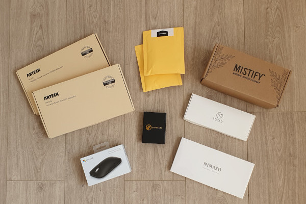
I recently travelled by air for the first time in 18 months. I was not travelling for work, but I was working while I was abroad, so I had to bring my laptop with me. The experience taught me that I needed to buy some new accessories!

All Accessories
All Accessories

Bluetooth Keyboard

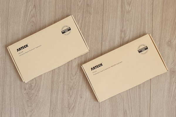
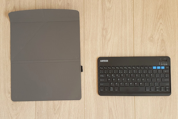
I already own an Arteck Bluetooth keyboard, and I use it with my phone a lot. I think that it is extremely useful, and I love it. However, I needed to buy a new one for travelling. So I bought the Arteck HB220B. I also bought the Arteck HC220 Protection Case.

Bluetooth Keyboard Boxed
Bluetooth Keyboard Unboxed
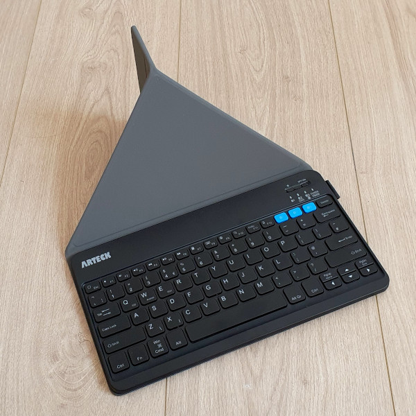
Bluetooth Keyboard with Cover

Both the keyboard and the cover are excellent. There are two features of the keyboard that are especially useful to me:

  • It is backlight, so it is very easy to use in low-light locations (e.g., a room at night, on a plane). There are seven backlight colours to choose from!
  • The keyboard can be used with three devices at the same time, and you simply switch device by pressing one of the bright blue buttons on the top right of the keyboard.

The keyboard and cover were the only accessories that I bought from Amazon UK. I was concerned that if I bought them from Amazon DE (Germany) then the layout of the keys would be slightly different. (I know that the functionality of the keys can be changed in the operating system, but the stickers on the keys would still be wrong.)

Screen Cleaner

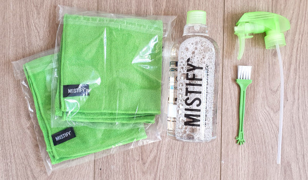
I am extremely fussy about keeping my laptop and phone screens clean, and I really hate streaks or specs on either. So I bought this Mistify Natural Screen Cleaner Set that includes clothes and solution.

Screen Cleaner Boxed
Screen Cleaner Unboxed

This is working well, and I have no streaks on my screens!

Carabiners

You can never have enough carabiners in my opinion! I think that they are extremely useful for connecting things to the outside of a laptop bag, and even to a trouser belt. A typical use for me would be clipping my headphone case to my trouser belt before boarding a plane so that I have easy access to them during the flight without having to open the overhead bin and opening my bag!

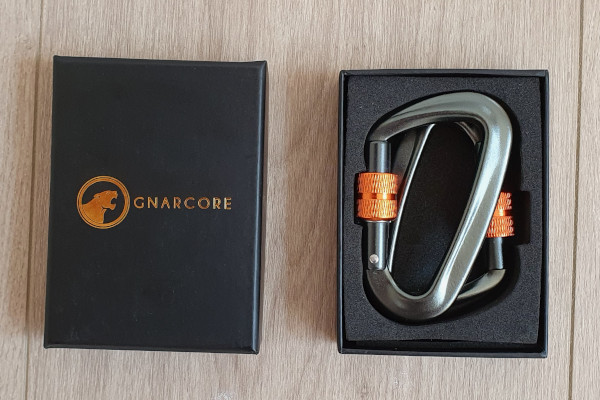
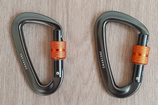
Unfortunately the exact pair of locking carabiners that I bought does not seem to be available any more, but these ones are similar: GnarCore Carabiner Set.

Locking Carabiner Boxed
Locking Carabiner Unboxed

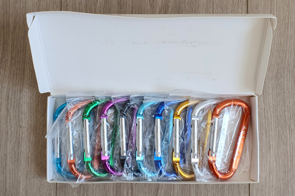
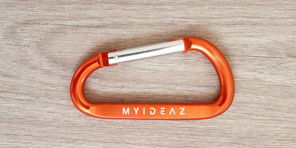
I also got a box set of cheaper non-locking carabiners: MyIdeaz Carabiner.

Carabiner Set Boxed
Carabiner Set Boxed
Carabiner Set Unboxed

I love the colours, but I thought that individually wrapping each carabiner was a waste of packaging.

Carabiner
Carabiner

Combination Locks

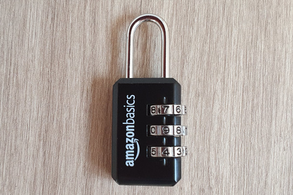
On two separate occasions I have had people try to pickpocket my backpack while I was wearing it, so I bought Amazon Basics AB-PL108 Luggage Locks to prevent this.

There were many other brands to choose from, and some of the other locks definitely looked more secure. I wanted combination locks, but I did not want locks that could be opened using a TSA key.

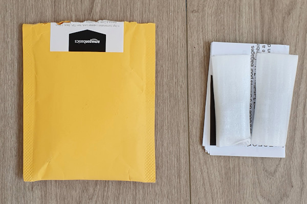
Combination Locks Packaged

I did not realise that there were two locks in the packet until I opened it!

Combination Lock
Combination Lock

The locks are very light, and they are unlikely to offer any resistance against a tool.

USB-C Cables

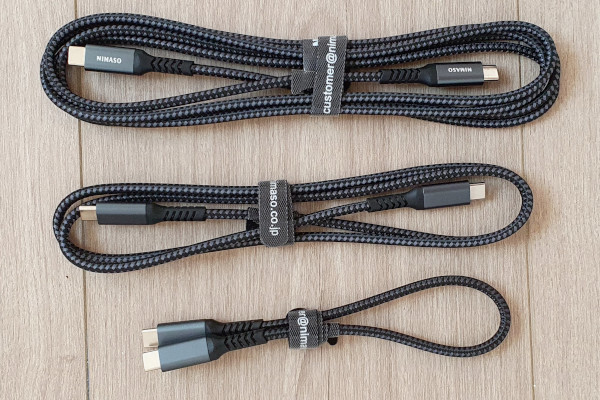
Finally, I bought some USB-C to USB-C Cables. My laptop has only USB-C ports, and my phone is USB-C, so it is very convenient being able to connect them together without any adaptors.

USB-C Cables
USB-C Cables

I liked this set because it contains three cables of very different lengths. I am probably using the shortest one the most when my phone is on a table beside the laptop.

Tags:


Apr 18 2021

XMind 2020

Category: Reviews,WindowsTeknovis @ 20:10

I have been using mindmaps for years, and I think that they are great! I was using FreeMind, but recently I found it stale and dated looking. Its successor (Freeplane) did not look much better.

I asked some colleagues what they were using, and XMind was the dominant answer. I liked the look of it, so I decided to give it a try.

Initially I was confused about the differences between XMind 2020 and XMind 8. I found two pages that summarise the differences:

However, I still found the differences confusing. Luckily you can can download them both and try them both – which is exactly what I did (in my Windows Sandbox)!

My conclusion is that XMind 2020 is a better tool for pure mindmapping, whereas XMind 8 contains a broader range of functionality, but less functionality for pure mindmapping.

Hence I decided to use XMind 2020. The main things that I like about it (beyond the fact that it is great mindmapping software) are:

  • There is a light mode and a dark mode.
  • It renders well on 4k screens.
  • The built-in styles look very elegant and fresh.
  • There is a good choice of graphic decorations (e.g., Markers and Stickers).

Unfortunately it is not perfect, and the following aspects annoy me:

  • There is a lot of wasted space on the toolbars, and there is no ability to add more icons (e.g., it would be nice to have a “Save” button there).
  • It supports multiple tabs, but I struggle to open an existing mindmap in a new tab. Instead, the second mindmap opens in a new window – which I hate! Luckily there is a workaround (How to open existing map in new tab?).
  • Panning using the mouse wheel is horrible (but at least you can use the right mouse button instead).

At the moment I am using the trial version, but I will probably move to the full version. The differences are explained here: What are the differences between XMind 2020 trial version and full version?

It is available for Android, but I do not see myself trying to work with mindmaps on my phone.

Tags: , , ,


Nov 03 2020

Dell XPS 17

Category: Hardware,ReviewsTeknovis @ 23:12

I recently bought a new Dell XPS 17 laptop. It has been years since I last blogged, so I thought that this would be a good time to post something new!

Unboxing

My unboxing experience with Dell has been very positive in recent years, and this was no exception. Having said that, I am not too fussed about the unboxing experience!

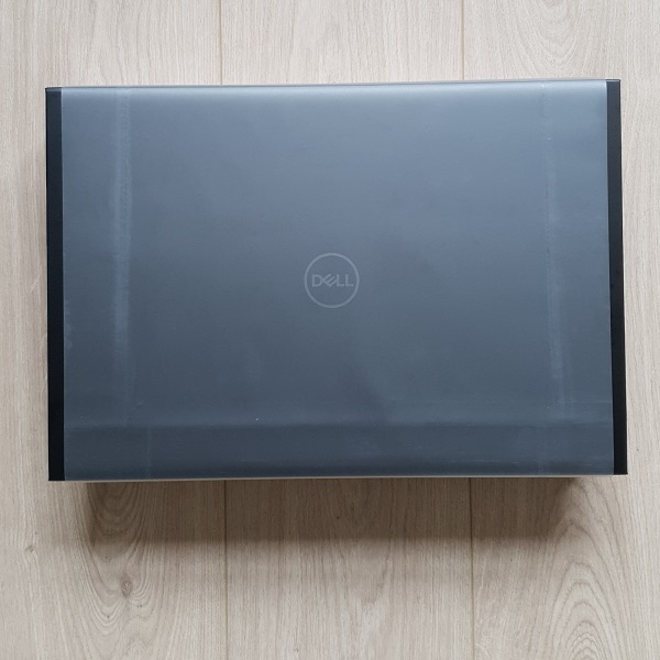
A courier delivered my laptop in a normal brown cardboard box. I opened this, and I took out the XPS 17 box.

Dell XPS 17 Box
Dell XPS 17 Box

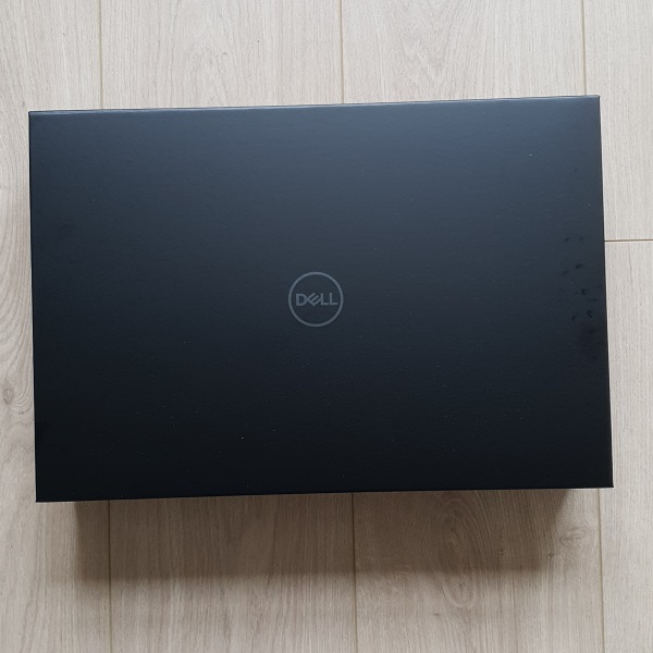
I assume that the clear plastic wrap was to protect the black box from scruff marks, but I thought that it was an unnecessary use of plastic. Also, the black box looked much better without the plastic wrap.

Dell XPS 17 Box
Dell XPS 17 Box

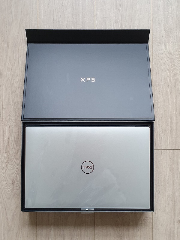
The box itself is very nice. It is kept closed by a magnet in the flap. I have keep the box for some other (as yet unknown) purpose! The laptop is within this box.

Dell XPS 17 in Box
Dell XPS 17 in Box

The laptop is also wrapped in clear plastic, but this is probably more worthwhile then the outer plastic wrap on the box.

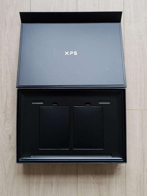
The charger and supplied adapter (Thunderbolt to USB and HDMI) are underneath the laptop.

Empty Dell XPS 17 Box

I was actually surprised that so little of the box is used. I think that it probably could be less than half of its height.

Perhaps the best thing about the unboxing experience is that the plastic is 100% recycled, and some of it has been salvaged from the sea! Well done Dell!

Accessories

I also bought a new mouse and a wired network adapter.

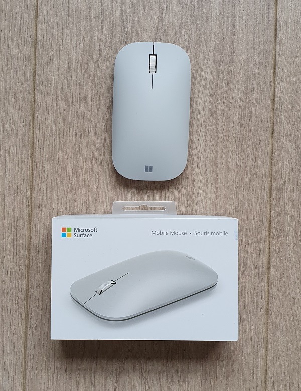
The mouse is a Microsoft Surface Mobile Mouse. The most confusing thing about buying this mouse was its name, and the difference between it and the Microsoft Surface Mouse!

I generally like Microsoft mice, but this one was a bit a gamble because it is so slim in the vertical direction. Luckily I find that it is very comfortable, and I love that I do not need to use a dongle in my laptop because it is a Bluetooth mouse!

Microsoft Surface Mobile Mouse

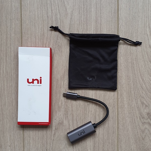
The wired network adaptor is from a brand that was not previously known to me. I use a wireless connection most of the time, but there are occasions when I need to upload/download gigabytes from my local network (e.g., raw photos for post-processing). I will use this adaptor on these occasions.

Wired Network Adapter

The only difficulty that I had when buying this adaptor was trying to understand the differences between a Thunderbolt adaptor and a USB-C adaptor.

I bought both the mouse and the wired network adaptor from Amazon Germany.

Tags: , ,


May 05 2014

Outliers

Category: Aviation,Entrepreneurship,ReviewsTeknovis @ 22:20

I finished reading Outliers by Malcolm Gladwell this weekend. For more information about it see Outliers or Outliers (book), and you can buy it at Outliers: The Story of Success.

I enjoyed reading it. It was fairly easy going, and it was always interesting.

Outliers by Malcolm Gladwell

Outliers by Malcolm Gladwell

There are plenty of reviews online already, so I am not going to add another. However, there was one very interesting piece of information that surprised me, so I will describe it here.

Chapter seven discusses plane crashes, and it describes a concept called the Power Distance Index (PDI). I will summarise this index by stating that a high DPI basically means that a subordinate is unlikely to be confident enough to contradict a superior, whereas a low DPI means that a subordinate sees himself/herself as an equal to his/her superior.

In the context of flying a plane, it is more desirable to have a pilot and co-pilot who come from a low DPI culture so that they can work well as a team of equals. In other words, if the pilot is doing something incorrect, then you want to co-pilot to be comfortable enough to clearly point-out the problem.

The book lists the five countries in the world where the PDI is highest between the pilot and the co-pilot. They are (in descending order):

  • Brazil
  • South Korea
  • Morocco
  • Mexico
  • Philippines

It is an interesting mix covering south and central America, Africa, and Asia. I am not able to see any pattern there.

However, the book also lists the five countries in the world where the PDI is lowest between the pilot and the co-pilot. They are (in descending order again):

  • United States
  • Ireland
  • South Africa
  • Australia
  • New Zealand

The thing that strikes me here is that they are all English speaking countries, and all former colonies of the UK. (This makes me wonder why the UK is not in the mix!)

I do not find this in any way surprising, because in a general sense these are all countries that share a language (English) that does not support formalities, and they provide relaxed workplace environments where subordinates and superiors are all friends!

Tags: ,


Jan 29 2012

Pulse Improvements

Category: Android,ReviewsTeknovis @ 09:31

I use Pulse on my Motorola Xoom. I love it, and it is possibly the most used application on my tablet. The combination of Pulse and the tablet has definitely enabled me to become more knowledgeable in everything from current affairs to hobbies!

Unfortunately, there are one or two limitation of the application that really annoy me :( I commented about this last week on Twitter, and the good people who develop Pulse read my comment and asked me to suggest how the application could be improved. So this is why I am writing this :) (I also love that Twitter enables interactions like this to occur between the application developers and the users.)

Catagories

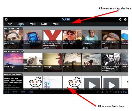
Imagine that I am interested in following feeds that fall into seven categories, for example, Economics, Politics, Sport, Travel, Lifestyle, Technology, and Property. Currently, Pulse allows me to have a maximum of five categories! So inevitably this limitation forces me to mix completely unrelated feeds together :( This looks wrong, and it makes it difficult to find the feeds that I want when they are bunched in with unrelated feeds.

The fix to this is very simple – allow an unlimited number of categories! There is plenty of space across the top for more categories! If this space become full, then let the user swipe to move from category to category (just like moving from port to post within a feed)!

While I am writing about categories, I remember that it used be possible to click on the category title to hide the row of categories. This was great, because it freed up some extra screen space. Unfortunately this feature has been removed :(

Feeds

Imagine that I am interested in following more than ten feeds within a single category. Actually, for three of the five categories that I have on Pulse there are more than ten feeds that I would like to follow! Currently, Pulse allows me to have a maximum of ten feeds per category :( Since I am limited to five categories, I cannot divide my categories any further to overcome this limitation :( This is particularly annoying when I follow several feeds that are updated infrequently :|

To fix this simply allow an unlimited number of feeds per category!

Screenshot

The diagram below (that I took from APP OF THE DAY: Pulse review (Android Honeycomb)) shows how both of these improvements could easily be incorporated! (Click image to see larger version!)

Pulse Improvements

Pulse Improvements

I do not see any technical reason why these limitations exist. My guess is that somebody hard-coded a number into an array somewhere!

It is probably worth remembering that these comments are coming from somebody who uses Pulse on an Android tablet with plenty of processor and memory resources, and a really fast WiFi Internet connection.

Hopefully this is useful!

Tags: , ,


Dec 31 2011

The Shadow Factory

Category: eGovernment,Reviews,SecurityTeknovis @ 15:32

I finished reading “The Shadow Factory” by James Bamford today. (Amazon link to book.)

"The Shadow Factory" by James Bamford

"The Shadow Factory" by James Bamford

It was an interesting read, but I felt that it lost its sense of direction somewhere in the middle :( In the beginning it read very like a novel describing the events leading to the 9/11 attacks. This was very gripping! However, the writing style then became more factual, and it seemed to randomly jump from topic to topic.

It was an interesting time to finish reading this book, because I see that part of its subject matter is in the media: Telecom Immunity Ruling Upheld by U.S. Appeals Court.


Dec 30 2011

Skype on Motorola Xoom

Category: Android,ReviewsTeknovis @ 17:18

When I wrote Motorola Xoom – First Impressions I noted that I was disappointed that Skype did not support video calling. During the Christmas holidays I installed the latest version, and I am delighted to report that it works perfectly!

I am delighted with this, and I have already used it for several hours during the holidays! I now have one less reason for turning on a computer :)

Tags: ,


Aug 30 2011

Firefox 6.0

Category: Reviews,SoftwareTeknovis @ 17:54

I started using Firefox 6.0 about two weeks ago. (I realise now that it was less than four months ago when I started using Firefox 4.0 according to Firefox 4. What happened that Firefox 5.0 was so brief?)

The feature that I find most interesting is the new Panorama (see Firefox Features or Firefox Panorama: The Web browser’s next big innovation). I am still getting used to it, but I am hoping that I can use it to de-clutter my Task Bar.

The most controversial aspect in my opinion is that the Startup page reverts to “Show my windows and tabs from last time” by default. I really wonder how many people will be caught-out because they were browsing sites they should not have been when they became interupted, so they closed the browser not realising that Firefox will restore everything when the browser is restarted! It could be very embarrassing!

Tags:


Aug 01 2011

Motorola Xoom – First Impressions

Category: Android,ReviewsTeknovis @ 19:56

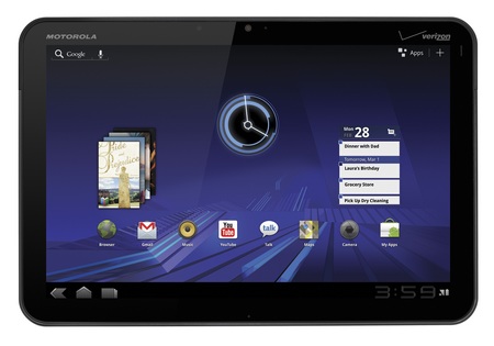
I recently bought a Motorola Xoom for myself, so this post describes my first impressions. Overall these have been extremely positive, and so far the device is exceeding my expectations!

Motorola Xoom

Motorola Xoom

I had decided that I wanted an Android powered table, and the only other contender was the Samsung Galaxy Tab 10.1. Both devices are extremely similar, so the ultimate decision was made on the form. The Xoom felt heavier, thicker, and solid. Whereas the Galaxy felt lighter, thinner, and it had a very plastic feel to it.

When I got the Xoom I initially played with it to learn about it, and I downloaded many applications for evaluation purposes. I then factory reset it, and configured it the way that I wanted.

Hardware

There is not a huge amount to write here, because there are already many good reviews of the hardware online. So here are a few comments:

  • The power button is located on the back surface in the upper right hand corner. I read several reviewers questioning that location, but I find it very convenient. I can comfortable switch it on and off using one of my fingers that is already there in order to hold the device.
  • Battery life seems great to me, although this is not something that I have measured. My biggest concern here would be the battery longevity in terms of recharge/discharge cycles. So far I am using the device until it fully discharges before charging it again.
  • The charge lead plugs into the bottom of the device (when it is in landscape mode). This makes using it while charging slightly difficult, because you cannot rest the device on our stomach.
  • The screen quality is really impressing me, especially when looking at photos. I also find it perfectly responsive.

Overall, I am finding the device very ergonomic, although my hands might be considered slightly larger than average.

Operating System and Bundled Applications

The device came with Android Version 3.2. So far I think that it is great, and I have no major issues. My comments are:

  • I am not a Gmail user, and I was concerned that every feature would need to be deeply integrated into a Gmail account. Luckily this is not the case, although I did create a trashy account to keep the device happy :)
  • I hate having to physically connect devices to a single computer. This is not required – sweet :)
  • The email client supports multiple IMAP accounts, although I am having difficulty deleting email. (They appear to delete, but when I check my email using another IMAP client the emails are still in my Inbox, but marked as read. I think the issue is that deleted emails should be moved into the Inbox.Trash folder.)
  • I wanted to create my own wallpaper, but I found it very difficult to find the exact required dimensions online. The best discussion on the issue is in Improved Wallpaper template, now with native resolution., but I am just using one of my own images that is a much higher resolution. The wallpaper tool is good in the way it allows you to crop the background wallpaper. If you want to use somebody else’s wallpaper then take a look at WallpaperCASA or xoom-wallpapers.com.
  • There is a bundled application for viewing common office file types. (See What is Quickoffice and why can’t I edit documents?.) I do not see myself needing to edit such files, but certainly viewing is extremely useful.
  • I have read that many people install task manager applications. For the moment I am happy to let Android look after this.
  • The browser seems great so far, and I absolutely love the Quick Controls feature (see Quick Browser Controls)!
  • I am starting to love widgets :)

There are many additional bundled applications such as calendars and contact lists. However, I have not used these because I am not interested in that functionality.

Additional Applications

I am more of a browser person than an application person, so an application must have real value or functionality for me to consider using it. Therefore, the additional aplications that I have downloaded have been limited to the following (in no particular order):

  • Flash Player: Whether you like it or not, many websites use Flash technology. My main motivation for getting this was to view some video-on-demand websites that I frequently visit.
  • ES File Explorer: It is interesting that the operating system does not come with a built-in file explorer. Perhaps this is because most users will never need one! However, I do, and his one seems perfect. Perhaps its best feature is that it enables me to directly connect to my file server (using SMB). This is fabulous for downloading my MP3s, photos, and other documents. The only small annoyance I have found with it is that you need to specify whether it should operate in landscape or portrait mode. It should detect this automatically!
  • Jota Text Editor: I wanted an application for taking notes, and subsequently sharing those notes between multiple devices. The initial note applications that I looked at all contained proprietary file formats. So I decided that a text editor was the way to proceed!
  • Skype: I use Skype a lot, so this was a necessity. It works fine, but I am disappointed that it does not support video calling. Hopefully this will change soon!
  • Pulse: This has probably been the application that has impressed me the most! To be honest, it is the first time that I have ever used an RSS reader on any platform, and it is so convenient!
  • Twitter: I tweet using multiple accounts, and this makes it so easy! The notifications and widgets are also very useful.

Some of these applications are not specifically designed for the large screen of the tablets, but they are perfectly acceptable as long as the zoom mode is not used.

So these are my first impressions! I expect many more posts on my Xoom :)

Tags: , , , ,


Next Page »