Jan 29 2012

Pulse Improvements

Category: Android,ReviewsTeknovis @ 09:31

I use Pulse on my Motorola Xoom. I love it, and it is possibly the most used application on my tablet. The combination of Pulse and the tablet has definitely enabled me to become more knowledgeable in everything from current affairs to hobbies!

Unfortunately, there are one or two limitation of the application that really annoy me :( I commented about this last week on Twitter, and the good people who develop Pulse read my comment and asked me to suggest how the application could be improved. So this is why I am writing this :) (I also love that Twitter enables interactions like this to occur between the application developers and the users.)

Catagories

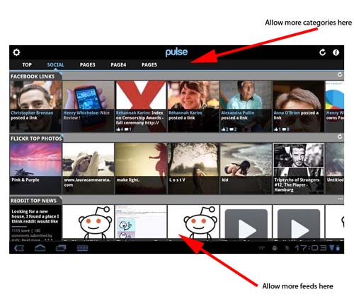
Imagine that I am interested in following feeds that fall into seven categories, for example, Economics, Politics, Sport, Travel, Lifestyle, Technology, and Property. Currently, Pulse allows me to have a maximum of five categories! So inevitably this limitation forces me to mix completely unrelated feeds together :( This looks wrong, and it makes it difficult to find the feeds that I want when they are bunched in with unrelated feeds.

The fix to this is very simple – allow an unlimited number of categories! There is plenty of space across the top for more categories! If this space become full, then let the user swipe to move from category to category (just like moving from port to post within a feed)!

While I am writing about categories, I remember that it used be possible to click on the category title to hide the row of categories. This was great, because it freed up some extra screen space. Unfortunately this feature has been removed :(

Feeds

Imagine that I am interested in following more than ten feeds within a single category. Actually, for three of the five categories that I have on Pulse there are more than ten feeds that I would like to follow! Currently, Pulse allows me to have a maximum of ten feeds per category :( Since I am limited to five categories, I cannot divide my categories any further to overcome this limitation :( This is particularly annoying when I follow several feeds that are updated infrequently :|

To fix this simply allow an unlimited number of feeds per category!

Screenshot

The diagram below (that I took from APP OF THE DAY: Pulse review (Android Honeycomb)) shows how both of these improvements could easily be incorporated! (Click image to see larger version!)

Pulse Improvements

Pulse Improvements

I do not see any technical reason why these limitations exist. My guess is that somebody hard-coded a number into an array somewhere!

It is probably worth remembering that these comments are coming from somebody who uses Pulse on an Android tablet with plenty of processor and memory resources, and a really fast WiFi Internet connection.

Hopefully this is useful!

Tags: , ,


Nov 16 2011

Pulse on Kindle Fire

Category: AndroidTeknovis @ 17:34

I read the Pulse will be included pre-installed on the Kindle Fire! See Pulse Scores Key Spot On Kindle’s Home Shelf; Co-founder Says It May Pass 10M Users This Year and Kindle Fire, Welcome to the Pulse Family!.

That is a great achievement, but then again, Pulse is a great application!

Tags: ,


Aug 01 2011

Motorola Xoom – First Impressions

Category: Android,ReviewsTeknovis @ 19:56

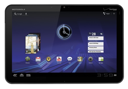
I recently bought a Motorola Xoom for myself, so this post describes my first impressions. Overall these have been extremely positive, and so far the device is exceeding my expectations!

Motorola Xoom

Motorola Xoom

I had decided that I wanted an Android powered table, and the only other contender was the Samsung Galaxy Tab 10.1. Both devices are extremely similar, so the ultimate decision was made on the form. The Xoom felt heavier, thicker, and solid. Whereas the Galaxy felt lighter, thinner, and it had a very plastic feel to it.

When I got the Xoom I initially played with it to learn about it, and I downloaded many applications for evaluation purposes. I then factory reset it, and configured it the way that I wanted.

Hardware

There is not a huge amount to write here, because there are already many good reviews of the hardware online. So here are a few comments:

  • The power button is located on the back surface in the upper right hand corner. I read several reviewers questioning that location, but I find it very convenient. I can comfortable switch it on and off using one of my fingers that is already there in order to hold the device.
  • Battery life seems great to me, although this is not something that I have measured. My biggest concern here would be the battery longevity in terms of recharge/discharge cycles. So far I am using the device until it fully discharges before charging it again.
  • The charge lead plugs into the bottom of the device (when it is in landscape mode). This makes using it while charging slightly difficult, because you cannot rest the device on our stomach.
  • The screen quality is really impressing me, especially when looking at photos. I also find it perfectly responsive.

Overall, I am finding the device very ergonomic, although my hands might be considered slightly larger than average.

Operating System and Bundled Applications

The device came with Android Version 3.2. So far I think that it is great, and I have no major issues. My comments are:

  • I am not a Gmail user, and I was concerned that every feature would need to be deeply integrated into a Gmail account. Luckily this is not the case, although I did create a trashy account to keep the device happy :)
  • I hate having to physically connect devices to a single computer. This is not required – sweet :)
  • The email client supports multiple IMAP accounts, although I am having difficulty deleting email. (They appear to delete, but when I check my email using another IMAP client the emails are still in my Inbox, but marked as read. I think the issue is that deleted emails should be moved into the Inbox.Trash folder.)
  • I wanted to create my own wallpaper, but I found it very difficult to find the exact required dimensions online. The best discussion on the issue is in Improved Wallpaper template, now with native resolution., but I am just using one of my own images that is a much higher resolution. The wallpaper tool is good in the way it allows you to crop the background wallpaper. If you want to use somebody else’s wallpaper then take a look at WallpaperCASA or xoom-wallpapers.com.
  • There is a bundled application for viewing common office file types. (See What is Quickoffice and why can’t I edit documents?.) I do not see myself needing to edit such files, but certainly viewing is extremely useful.
  • I have read that many people install task manager applications. For the moment I am happy to let Android look after this.
  • The browser seems great so far, and I absolutely love the Quick Controls feature (see Quick Browser Controls)!
  • I am starting to love widgets :)

There are many additional bundled applications such as calendars and contact lists. However, I have not used these because I am not interested in that functionality.

Additional Applications

I am more of a browser person than an application person, so an application must have real value or functionality for me to consider using it. Therefore, the additional aplications that I have downloaded have been limited to the following (in no particular order):

  • Flash Player: Whether you like it or not, many websites use Flash technology. My main motivation for getting this was to view some video-on-demand websites that I frequently visit.
  • ES File Explorer: It is interesting that the operating system does not come with a built-in file explorer. Perhaps this is because most users will never need one! However, I do, and his one seems perfect. Perhaps its best feature is that it enables me to directly connect to my file server (using SMB). This is fabulous for downloading my MP3s, photos, and other documents. The only small annoyance I have found with it is that you need to specify whether it should operate in landscape or portrait mode. It should detect this automatically!
  • Jota Text Editor: I wanted an application for taking notes, and subsequently sharing those notes between multiple devices. The initial note applications that I looked at all contained proprietary file formats. So I decided that a text editor was the way to proceed!
  • Skype: I use Skype a lot, so this was a necessity. It works fine, but I am disappointed that it does not support video calling. Hopefully this will change soon!
  • Pulse: This has probably been the application that has impressed me the most! To be honest, it is the first time that I have ever used an RSS reader on any platform, and it is so convenient!
  • Twitter: I tweet using multiple accounts, and this makes it so easy! The notifications and widgets are also very useful.

Some of these applications are not specifically designed for the large screen of the tablets, but they are perfectly acceptable as long as the zoom mode is not used.

So these are my first impressions! I expect many more posts on my Xoom :)

Tags: , , , ,